A brand made for horse people, and the system that keeps it
The positioning, the tone of voice, the words and a brand refresh for Bascule Underwriting, an equine and farm underwriter. Then a design system that keeps every document, screen and post on brand, so Bascule's own team can make them too.
- Client
- Bascule Underwriting
- Built
- Position, voice and brand
- Then
- A design system
- Carried by
- Web, social and print
Specialist cover, sold by agents, chosen by people who know horses.
The problem. Bascule speaks to two audiences at once: the independent agents who sell its cover, and the horse owners who have to trust it. Most carriers treat horses as a footnote on a farm policy. Bascule had the opposite story to tell, and it needed one brand that told it the same way everywhere, from a policy document to a magazine page.
The approach. We started with the position and the voice: made for horse people, and plain where insurance is complicated. Then the brand refresh, and a design system that turns it into rules, templates and components, so every touchpoint matches and Bascule's team can make its own.
Bascule's design system, running as code.
The colours, type and components the website is built on. Pick one to see its token as CSS or Tailwind, with the contrast checked.
Blue
Buttons, links, the italic accent on white, and the sweep
:root {
  --blue: #354CF4;
}

.button {
  background: var(--blue);
}- On white
- 6.0:1 · AA
- On Bascule ink
- 3.2:1 · AA large
Where the brand sits.
The guidelines set Bascule's character on five scales: clearly more mature than youthful, a little more sophisticated than playful, literal before abstract, and in the middle on price and on tradition.
- Mature or Youthful: clearly mature
- Playful or Sophisticated: a little more sophisticated
- Economical or Luxurious: in the middle
- Literal or Abstract: a little more literal
- Traditional or Contemporary: in the middle
What we made
From the position to the templates Bascule's team uses every week.
- The position: made for horse people, with five lines of cover from one carrier
- A tone of voice that is plain, warm and expert, written as people who own horses
- The words for the website: products, claims, agents, guides and news
- A refreshed logo, the BasculeUW wordmark and a mark for small spaces
- Brand guidelines for colour, type, photography, logo use and character
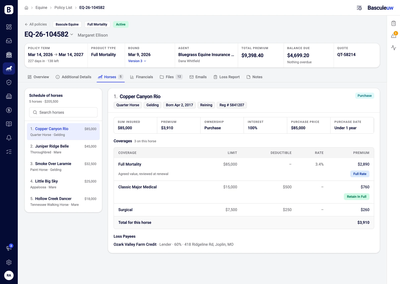
- A design system in code, with the tokens and components the website is built on
- Templates for LinkedIn posts, Instagram stories, adverts and branded documents
- Pages and pieces for magazine partnerships and event sponsorships
One brand, from a story to a policy.
An Instagram story, an advert for agents, a magazine page and a policy summary, redrawn here with invented details.
Four Bascule pieces in the 2026 brand, redrawn with invented details: an Instagram story reading Made for horse people, an advert offering agents free portal access with no volume commitments, a full-page magazine advert listing three lines of cover, and the cover of an equine mortality policy summary. Each is navy with the electric-blue sweep.

Where it stands
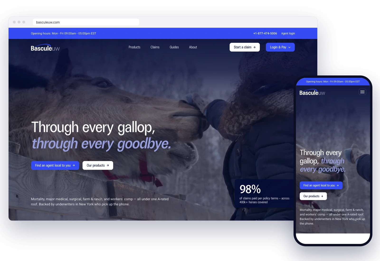
The new brand is live on Bascule's website, its LinkedIn and its documents, and it reaches agents and owners through magazine partnerships and event sponsorships.
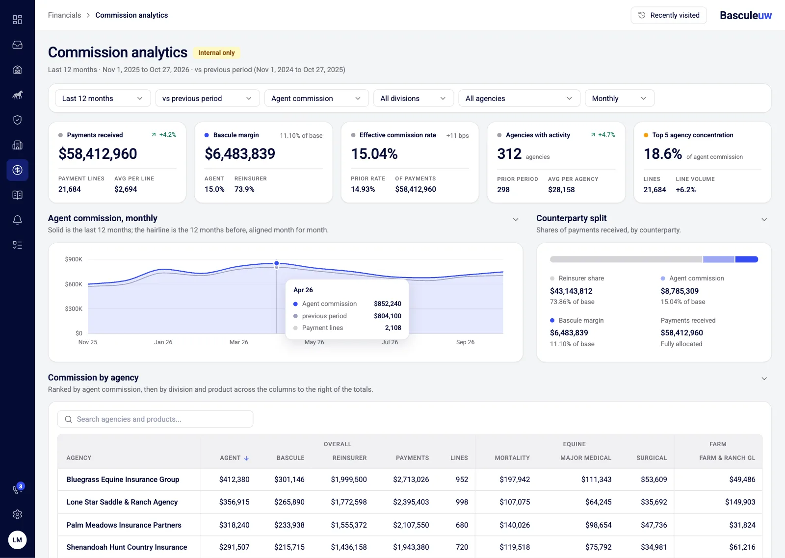
Because the rules live in the design system, Bascule's own team now makes LinkedIn posts, new website pages and branded documents itself, and every one of them matches.
What we used
- Claude DesignThe brand applied to screens, then handed over as working code
- Next.jsThe design system's components, as the website uses them
- LinkedInPosts every week in the brand's templates
- SupabaseThe content Bascule's team edits, on brand by default